Pages

Friday, October 24, 2014

Face It

"Face It"
Art journal mixed media sketch
Artist Cindi Moynahan-Foreman

This art journal sketch above reflects my mood this week given the tragic events in my neighbourhood of Ottawa. It makes no sense and it makes me sad.

Shifting Focus


I am planning to move to still life paintings over the months of November and December.

I love doing figurative and landscape works but now, as the weather turns, I too am turning to something new.

I love to explore new subjects and new methods. I have done so very few still life paintings despite the fact that I love them when I see them at an art gallery and see what other artists have done. (Like Al Gury below)

Alla Prima painting by Al Gury


Thursday, October 23, 2014

"Sony"

This is my latest acrylic, the second in a four piece grouping. It features my son when he was very young doing what he loved to do most - hide in boxes.

"Sony" 6x6 acrylic
Artist: Cindi Moynahan-Foreman
The previous piece in this series was called "Pumpkin" of my daughter when she was quite young.

"Pumpkin" 6x6 acrylic
Artist Cindi Moynahan-Foreman

The pair

The Concept Sketches

My art journal value sketches for "Pumpkin" and "Sony"
(note how Sony box values were adjusted)

My art journal concept sketches for a grouping of
four 6x6 acrylics

Wednesday, October 22, 2014

Art Kits & Supplies

I stumbled upon a great "Pinner" Jennifer Alvarez on Pinterest 
and one of her boards is on "Art Kits and Supplies" with 
3, 263 pins as of October 2014!

If you enjoy browsing art supplies, this is a must visit.

Below is one of my favourite pins

Russell Stutler's Book about Sketching, Page 4: Tools and materials 


Other Interesting Art Kit "Pinners"


Friday, October 17, 2014

Artists in Canada

In October 2014 Hill Strategies published "A Statistical Profile of Artists and Cultural Workers in Canada" based on 2011 data.

Art Journal Page based on the Statistical Profile of Artists in Canada
Artist: Cindi Moynahan-Foreman


Did You Know?


  • There are 136,600 artists in Canada who spent more time at their art than at any other occupation in May of 2011
  • One in every 129 Canadian workers is an artist.
  • The number of artists (136,600) is slightly higher than the labour force in automotive manufacturing (133,000) 
  • There was a 56% increase in the number of artists in Canada between  1989 and 2013. This is higher than the 38% increase in the overall labour force.
  • Women represent 51% of artists 
  • Average income of artists is 32% lower than other workers ( averages $32,800)
  • Female artists earn much less than their male counterparts
  • Aboriginal and visible minority artists have particularly low earnings.
  • Nunavut’s X0A region is the most creative rural area in Canada. 

Artists in Ottawa (2006)


Individually, the five cities in this study (Montreal, Ottawa, Toronto, Calgary and Vancouver) have the largest number of artists of all Canadian municipalities. Toronto has the largest number of artists (22,300), followed by Montreal (13,400), Vancouver (8,200), Calgary (5,100) and Ottawa (4,600).


  •  About one in  every twelve Ontario artists resides in the City of Ottawa (4,600, or 8%). 
  • The K1M neighbourhood ranked #1 in concentration of artists (Only in Ottawa did the top-ranked neighbourhood in 2001 remained top-ranked in 2006)
  • Ottawa and Calgary have a  higher percentage of female artists and a higher earnings gap between artists and all local  workers

More Links about Artists in Canada

NB Because of the Harper government's major changes to the data collection methodology between 
the 2006 census and the 2011  National Household Survey, 
data in the 2014 report are not comparable to data in  previous reports in the Statistical Insights on the Arts series.


Tuesday, October 14, 2014

Blessed Are We Who Stand Before The Easel

Plein air supplies

For as long as I can remember, I have been looking for art inspiration, new art materials, new art techniques and the work and wisdom of other artists.

Robert Genn (1936-2014) is an example of an artist I have found along my journey who has so generously shared his work and wisdom through his Painter's Keys twice-weekly letters to everyone  (like me) who has subscribed to this free service. (Read the welcome letter here.)

I am grateful that his daughter Sara intends to continue the Painter's Keys letters and the well organized and useful Art Quotes page.

A few nuggets of wisdom from Robert G. that I cherish and think about all the time:
  • Your easel, your altar: "You might pause to consider how blessed are we who daily stand or sit before the easel.."
  • The Idea Life Cycle: "You can't be an apple seller without apples in your apple cart."
  • On signing and dating: "...signatures should be clear, consistent and pretty well always in the same place--lower right....the colour of the signature can often be harmonized or integrated into the painting...My advice to most artists is "unobtrusive but clear."
  • On solo shows: "The solo show, while often a vexing experience, is nevertheless a catalyst that can bring out the best of what is currently in you. Shows help to define an artist." 
And I love Robert's "Eleven Steps". Steps 1, 4, 7 and 10 are ones that resonate with me:
  • Step 1. Art is a perfectly complete cause. 
  • Step 4. You are responsible for radicalizing your strengths. 
  • Step 7. Learn from the greats, and expose yourself to better work.. 
  • Step 10. "Play" is your route to mastery.

One of my workspaces ....one of my altars.

My art journal that I play in daily.
Blessed am I.


Monday, October 13, 2014

Art Journal Pages


"Mums"
Mixed media - art journal page
Artist Cindi Moynahan-Foreman

Over the Thanksgiving weekend, I marvelled at how the plants on my patio were still flowering and flourishing this late into September and I wondered how much longer they would last? I also read a book that encouraged artists to create mandalas and described how Carl Jung would paint a mandala every day to reconcile aspects of his own life and psyche.

Both of these inspired my art journal page: I used a mandala printout with a labyrinth in the centre and added gesso and acrylic paint to add the plants in the foreground. This art journal entry was done while the Thanksgiving turkey was cooking in the oven.

Ottawa Valley Road Trip

The art journal page below was inspired by a three-hour road trip where the intention was to take in the beautiful fall colours in the Ottawa Valley.

We found signs to an estate sale on Sixth line (March Township) and we drove the long beautiful driveway to the estate that sat on a hill overlooking the Ottawa River.

Next door to the estate sale stood an abandoned church and cemetery. I later researched the location and discovered that this was St. Mary's Church and Cemetery (N45.439722, W75.953056) erected in 1828 by Hamnett Kirkes Pinhey.

St Mary's Church and Cemetery
March Township, Ottawa
The church can be seen on the left


To someone like me who loves genealogy and history, stumbling accidentally on this place was a true delight. (I have added some interesting links below).


I wanted to capture the estate using a loose water colour and ink painting in my art journal. I wondered what it must have been like to wake every day to such a magnificent view of the river.

We did not purchase anything at the estate sale.

As I looked through the items for sale at the estate sale I thought 'wouldn't it be great if the person who lived there was an artist and kept an art journal and painted in it every day'.

Perhaps (s)he did.

"March Township"
Water colour and ink - art journal page
Artist Cindi Moynahan-Foreman
Pinhey's Horaceville 
Some Links


Saturday, October 11, 2014

Exercise in Abstraction


"She Who Hesitates"
Artist: Cindi Moynahan-Foreman
My first plein air abstract 

This is the abstract painting that I completed on Day 2. It was my first time doing an abstract painting. I was clearly well out of my comfort zone. I do feel that this exercise taught me a lot.

The rules I had set for myself before starting that day were designed to take me as far out of my comfort zone as possible:
  • Use Phthalo Blue (green shade) PB15 (COOL ) and no Indanthrene Blue PB60 (WARM). This rule for the day because I am not fond of Phthalo blue...it's too overwhelming and Indanthrene blue is easier and safer.
  • Use grey formula #2: Quinacridone Magenta PR122 + Phthalo Green yellow shade + Titanium White. My go to grey formula (the easiest) is Burnt umber + Indanthrene blue + Titanium white
  • Use a black gessoed board. I couldn't imagine how a transparent colour palette would work on black gesso?
  • Chalk the sketch and do not paint over the chalk (chalk to be washed off later under the tap to reveal the black lines) Solid blocks of colour with no gradations whatsoever!
My french easel with the black gessoed board

I described the scene in my art journal, " Interesting log with woodpecker holes, in foreground there is a beautiful rock - smooth red/green and a gorgeous Georgian Bay white pine on the left....lots of underbrush."

My notes
I would love to try this exercise again without making some of the same mistakes that I made this time. 

For example, in my notes you can see that I stopped and started many times on this. I had created a value sketch and then converted it to a colour block sketch (top right) and I then developed the painting from there. I stopped and started several times. (Thus the name for the painting "She Who Hesitates")

Folks who liked this painting said it reminded them of the works of Norval Morriseau which I take to be a great compliment!

Photograph of the location

"She Who Hesitates"

Thursday, October 9, 2014

Killbear Mixed Media Collage

Killbear #2
Artist: Cindi Moynahan-Foreman
11x14 Mixed Media (on hardboard)

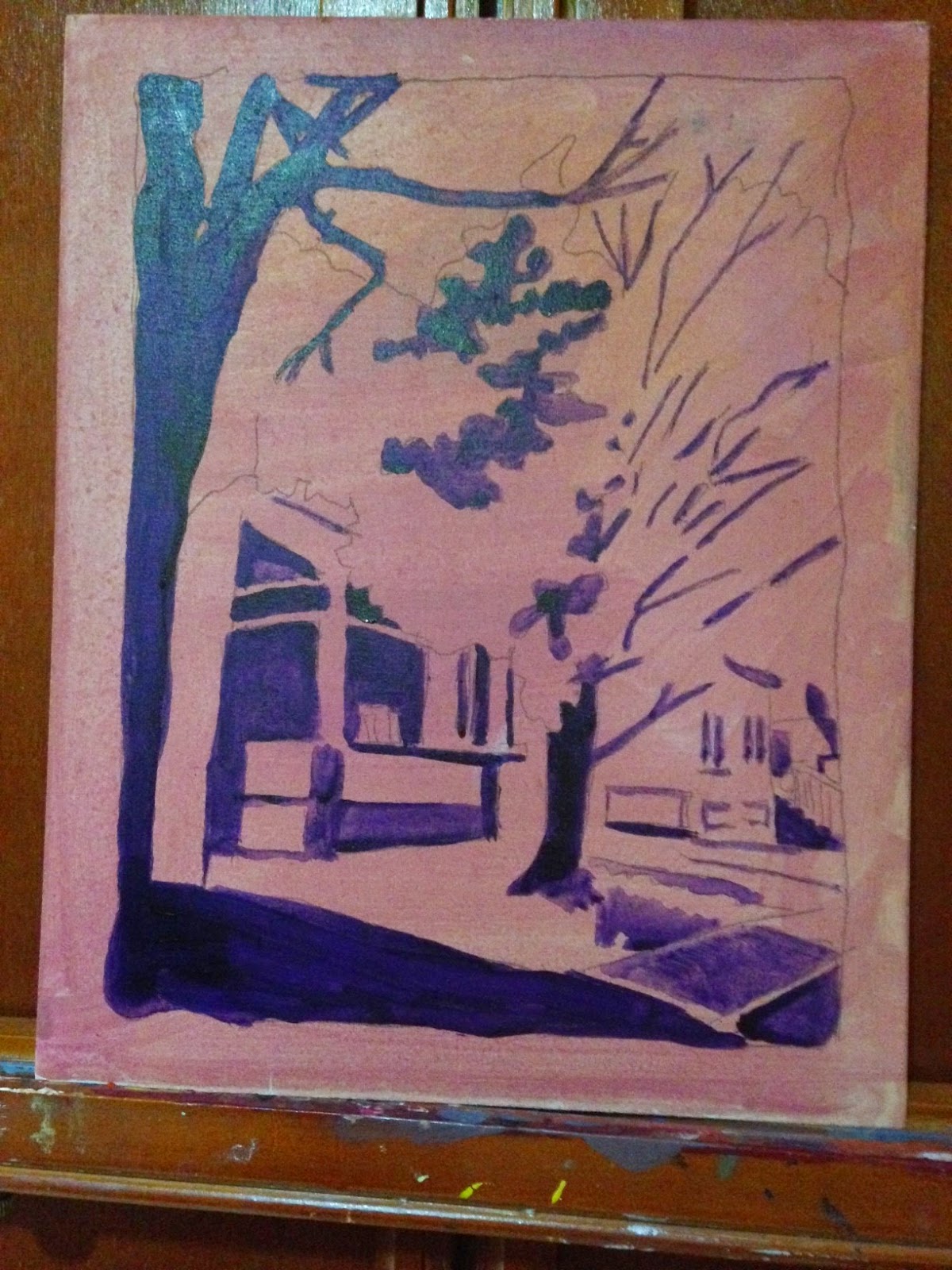
This started as a plein air piece that I began to paint in the late afternoon and (unhappy with the results) decided to abandon.

I loved the contrast of the hard, dark, grey/blue rock and the soft, sunlit, green/yellow grasses. I loved watching the movement of the grasses in the gentle wind.

Later that evening I attempted to salvage the painting by adding soft pastel. This helped a little but it still was not exactly what I wanted to achieve.

I then decided to tear strips of paper from some Killbear campground maps and paste them to the board to give structure to the rocks. I loved how this was developing on top of the acrylic and pastel background!

Finally, I took out my acrylic coarse modelling paste and applied it with a toothbrush to emphasize the beautiful rhythms of the sunlit grasses on the rocks.
Detail 1: Collage of campground maps.

Detail 2: Collage and coarse modelling paste

Detail 3: Collage and coarse modelling paste to show movement of the grasses
I am quite happy with the final result and this certainly reaffirms that there's no harm in playing or "moodling" (as Brenda Ueland would put it) when your Plan A (i.e. an acrylic plein air) fails to achieve the results you had hoped for!

Killbear #2 (unframed)

The imagination needs moodling, 
long, inefficient happy idling, 
 dawdling and puttering. ” 

~Brenda Ueland~

Cooper Street Colours

Cooper Street Colours
(8x10 acrylic on hardboard)
Artist: Cindi Moynahan-Foreman
It was a damp, rainy, dark morning. This fact made the colours of this beautiful tree even more spectacular. I just had to paint it!

The underpainting
Checking my values
Finished piece

The photograph

Sunday, October 5, 2014

To every age its art...

This past summer there were plein air artists scattered around Centretown and Lowertown in Ottawa.

Plein air artist spotted in Centretown (Ottawa, Ontario)

The quote on the back of this artist's shirt reads :

To every age its art, 
to art it's freedom."
~Ludwig Hevesi~

The shirt was made by the National Gallery of Canada. I am not sure if they were the organizers of this particular plein air event?

If anyone visiting this blog knows where one could look at the plein air artwork, please leave information in the comment section below. And if you know the identity of this particular artist, please share that as well.

Saturday, October 4, 2014

Harold's Point

"Harold's Point"
14 x 10
Artist: Cindi Moynahan-Foreman ©
Water colour on Arches cold pressed
(100% cotton/140 lb)
I loved sitting in this location in the morning sun. 
The water colour that I completed here was most unsatisfactory so 
I turned the paper over and painted this scene from the photograph.
(The photograph can be seen here.)

Friday, October 3, 2014

Art Journal Composite

Composite of art journal sketches from
Plein air September 2014
It was great to explore a new palette and new plein air techniques under the excellent tutelage of Helen Walter and Keith Thirgood

The Wilson Street Studio palette included the following transparent colours:
  • Hansa Yellow Medium PY73 WARM 
  • Napthol Red Light PR9 WARM 
  • Quinacridone Magenta PR122 COOL 
  • Indanthrene Blue PB60 WARM 
  • Phthalo Blue green shade PB15 COOL 
  • Burnt Umber PBr7 WARM 
  • Phthalo Green yellow shade PG36 COOL 
  • Titanium White 
The "new" Liquitex heavy body palette, my "old" Winsor and Newton palette
and the "Real Color Wheel"

You can read more about the "New, practical, artist's colour theory" 
at the Wilson Street Studio blog
for an explanation on the Real Color Wheel (RCG)

Major Lesson #1: You can't mix the perfect colour


The blue square in the red picture is the same colour
as the red square in the green picture.
Courtesy of James Gurney.
The surrounding colours trick the human eye
into incorrect interpretation of colour. 

Pieces A/B/C are the same colour. 

Major Lesson #2: Learn to Master Your Greys


We experimented with three grey formulas: Titanium white added to:

Burnt Umber PBr7 + Indanthrene Blue PB60 
Quinacridone Magenta PR122 + Phthalo Green yellow shade PG36 
Napthol Red Light PR9 +  Phthalo Green yellow shade PG36