Pages

Thursday, March 31, 2016

More Dark Field Monotype with Mixed Media

"Lexie Love" Monotype with mixed media
 "Lexie Love" is my latest experiment with the dark field monotype and mixed media. Again, lots of mistakes happened (see below) but that's the fun part of learning a new art process.


Lexie, my yellow labrador retriever, is one of my favourite subjects.

My taped off glass plate and black and white reference photo.

I purchased some glass to use as my plate this time given my struggles using the "creative palette" and the acetate on my last two attempts. Glass is okay to use as a monotype plate if you are not using a press and hand printing.

I taped around the edges of the glass and then taped off a rectangle on the glass plate the size of my image using masking tape. This was really helpful when it came time to print! 

I also purchased some non-slip material that Belinda Del Pesco recommends in her informative printmaking videos.

I printed my colour photograph in black and white to assist me in my inking.

INK: I used the AKUA Intaglio Payne's Gray again this time I rolled it on my inking plate and not directly onto the plate as I did on my first attempts.

PAPER: I planned to use some Canson watercolour paper that I had. I had bought it in large sheets and I reduced it to smaller pieces and I soaked it and I sprayed it again before hand printing.
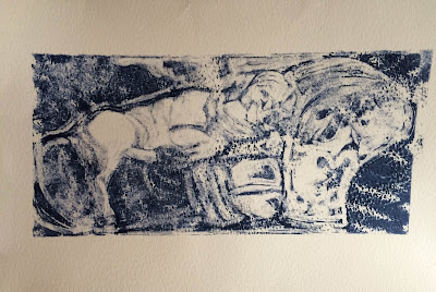
The dark field monotype print.

I was not entirely happy with this resulting print (above). The finer details on my inked plate were completely lost on the textured watercolour paper and my hand printing with the metal spoon resulted in some strange lines despite having moved the spoon very gently in small circles. I also noticed that the paper slipped somehow (see upper right hand corner.) resulting in a registration smudge.

I was hopeful that I could salvage the print with some mixed media work. The ink dries really fast and I used watercolour, gouache and pastel.

There were a couple of points where I wondered why wasn't I just painting on watercolour paper rather than printing and then painting? The answer, for me, is that there is something lovely about excavating the image from an ink-smeared sheet of glass and then the complete loss of control when you go to pull the print.

By adding mixed media to the monotype as your last step you get to play with your mistakes. I think that there are some interesting textures that emerge.

Interesting textures emerge


I am really enjoying these experiments in printmaking. Stay tuned for the landscape, cityscape and architectural experiments next!

My Daily Sketch - Lovely Lily

My daily sketches are really important to me for a number of reasons. They are a permanent record of my journey as an artist over the years and my sketches record everything I love.

"Lovely Lily" in my art journal
(Strathmore500 series - 100% cotton paper)

I have so many art journals filled with my urban sketches created from direct observation or sketches made from photographs that I have taken or found in magazines or online.

Sometimes the daily sketch idea is born from something I heard on the radio, or poetry I have read or an article that inspired me. Often I sketch members of my family. In fact, I sketch family a LOT!

Daily Sketch "Lovely Lily"
(Gouache and watercolour)
This was a family photo posted on Instagram captioned, "When you call her a cat and she insists she is a lion!!! ROAR " I have such love for this sweet child (and her whole family) Of course "Lovely Lily" is today's daily sketch!

Monday, March 28, 2016

Exploring Dark Field Monotype with Mixed Media #1

A monotype is a hybrid of drawing and printmaking. Monotypes are divided into two types - the dark field and the light field.  Degas used the dark field method of monotype

Edgar Degas's "Three Ballet Dancer (Trois danseuses)," 1878-80.
(Sterling and Francine Clark Art Institute)
"Although the monotype process typically yields a single print, Degas often made more than one impression, or “pull,” from a plate. Each successive pull yielded a less intense, more degraded image—both a repetition and a transformation—and these later prints often served as the basis of Degas’s pastel drawings. (Source: Wall Street Journal; To Better Understand Degas’s Prints, MoMA Team Got Hands Dirty)

Edgar Degas - The Star - Pastel over Monotype
 It is estimated as many as a quarter of Degas' pastels 
have a monotype underlayer

The Breakfast - Monotype with Pastel and Graphite - Edgar Degas

Belinda Del Pesco posted a video recently about trace monotype printing (see Monotype: Between Friends (& a video tutorial on Trace Monotype). This is when I knew for sure I had been bitten by the bug to pull out my printmaking supplies and get printmaking again!

In the video below, Belinda Del Pesco shows how to make a dark field monotype with mixed media.


Time to Explore!

After watching Belinda's videos, I was so excited to start experimenting and exploring this new process!

I gathered some photos that I thought would be interesting to experiment with dark field monotype in a few of my favourite subject categories:
  • animal (Lexie)
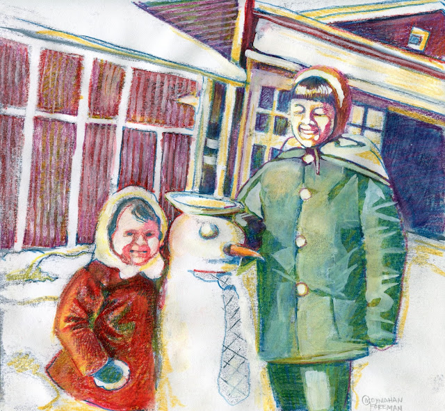
  • figurative (snowman building)
  • architecture (Abiwin porch)
  • a portrait (Great grandmother)
  • landscape (lavender farm)

Photos gathered for my monotype experiments
Mt First Experiment - The Snowman

To make things simple, I thought it best to start my experimentation with some simple black and white photos. I started with the snowman.

"TheSnowman"
With my first subject selected. I gathered together everything I could find to make my first monotype: My Akua Intaglio ink (payne's gray), various papers, the creative palette, a spray bottle, a brayer, etc.

I wasn't entirely sure that the creative palette would work with this method (softer than plexiglass or zinc plates)  but I had purchased it on sale at Michael's and never used it so I thought it would be a good place to start.


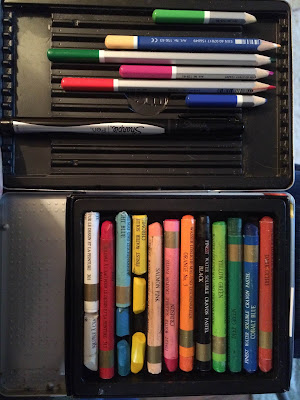
For the mixed media materials, I gathered anything that I thought might be interesting and/or useful: my watercolours, pastels, pastel pencils, conté crayons, watercolour pencils etc


Below is my initial result using mixed media on my ghost print:

Dark Field Monotype with Mixed Media: First Attempt (Ghost Print)  


The plate with ink on it

The first pull and the ghost print
 Lessons Learnt on My First Attempt

My 'learnings' from this first experiment
  • the creative palette is unsuitable for this process. After using it for my first attempt, I washed the plate off, re-attached the acetate liner and used the acetate liner for my next attempt. 
  • the Akua Intaglio ink is beautiful - does NOT dry on the plate (only when it makes contact on the paper). It cleans up beautifully, has no smell and dried quickly taking all the wet mediums I added later without smudging. The colour - payne's grey - gave interesting results but I think a Mars black would have worked better?
  • I completely forgot to dampen my paper before printing (even though I had my spray bottle handy) and I wonder what the result would have been if I had not forgotten?
  • Paper matters! I used the printing paper that I had on hand and the SUBI block printing paper - while lovely for my linocut prints - reacted badly to the wet medium I added. The Strathmore printmaking paper I have on hand was great for gelli printing but I suspect it will be disappointing with the mixed media process here as well. I plan to stick to a good mixed media paper or watercolour paper for my next attempts.
  • I loved trying all kinds of dry and wet media after my print dried. The inks, as promised, took pastel beautifully. What I really enjoyed using was my watercolour pencils and gouache. I think I would like to continue experimenting along that vein.
I really enjoyed the dark field monotype with mixed media process despite my immediate failures, errors and omissions, I can't wait to try my next one!

Sunday, March 27, 2016

Saturday, March 26, 2016

Friday, March 25, 2016

My Daily Sketch - Hydrangeas

My art journal (Strathmore500 series - 100% cotton paper)
Ottawa received some snow and ice over the past few days so I was happy to stay indoors today and sketch flowers.

I also watched some youtube videos on monotype printmaking. I am obsessed with it presently and gathering all sorts of images to try.

Here are the two videos I watched:

Monday, March 14, 2016

Still Life Styles


I bought some brightly coloured fabric recently to use in some spring still life pieces. This is the first of several pieces that I am working through in my art journal.

Black & White 

I always try to do some small black and white sketches whenever I am working on something new like this still life. This helps me to work out the composition and it helps me again later when I am working in colour.

Black and White Still Life

After sketching and painting the still life in black and white, I then painted in gouache, watercolour and mixed media. It was a great exercise for my art journal.
Gouache

Watercolour


Mixed-media


This post was inspired by the following Mark Adam's quote.


Sunday, March 13, 2016

Dusting Off My Printmaking Supplies

I love exploring new printmaking techniques and I have blogged before about some of my printmaking adventures.

Last fall I explored monoprinting on a gelliplate at the Ottawa Art School Fair (see my blog post: Print Addiction With Golden Acrylics) and I haven't done any printmaking since!

Lately, I have been feeling the urge to pull out my printing inks and brayers and start on some new printmaking projects. I couldn't decide if I was itching to do a new linocut or play some more with monoprinting? That's when I remembered I had an unopened Stampendous Creative Palette.

My previous printmaking adventures
I really want to explore using monoprinting as a part of  developing some mixed-media art concepts and that's why I bought a Stampendous Creative Palette at Michaels.

The Stampendous Creative Palette promised that I could:
"Create infinite monoprinting backgrounds and patterns with this indispensable mixed media tool. Use with any color media such as acrylic paint, ink, etc. Lightweight, easy clean-up and storage, durable. Easy to follow instructions on the package and instructional videos on the Stampendous YouTube Channel."


"Creative palette" (CP) versus "Gelli Arts" (GP)


Having already "played" with the gelliplate last fall (and really loved it),  I wondered is there any difference between the CP and the GP? Apparently there is:
  • the Creative Palette cannot do everything the Gelli Plate can do. The packing tape technique is one thing that comes to mind immediately. It does, however, work beautifully with stencils....Stencils create amazing effects on the CP with the use of a foam roller brayer or sponge daubers.
  • the Creative Palette is a firm, lightweight, flexible surface. It can be lifted and brought to the surface easily, like a stamp.
  • the Creative Palette may be stored in any position, in or out of it's secure, snap-shut case. Other monoprinting surfaces must be stored flat

CraftTestDummies did a video demonstrating some of the differences here


I plan to do some print concept sketches over the next few days and then pull out my inks and brayers and get started. I definitely want to try at least one project on my unused Creative Palette. Stay tuned for some more of my printmaking posts over the next few weeks. 

Links


Wednesday, March 9, 2016

Horsing Around

Photos of my horse Blaze
I am working on an idea using old photos that I have of very special times, places, people and pets in my life. Harvesting images that I love and being playful with them. I am not sure where this is going, but I am having fun.

Photos of my sketches in my art journal

 In the journal sketches above I experimented with line using a Sharpie, noodler's ink, watercolour and gouache.


Urban Sketching The Ottawa Farmers' Market

Ottawa Farmers' Market
Art-is-in Bakery booth
Sketched in my Strathmore Art Journal


The full page scan

Tuesday, March 1, 2016

Another Night Drawing At The Rooster (#25)

It has been quite a few months since I was able to attend a "Drawing At The Rooster" (DATR) session hosted by Ottawa artists Peter Purdy and Rebecca Gilman. The last monthly session that I attended was in October 2015 Drawing at the Rooster #20 - Heroes and Villains.
"Drawing at the Rooster is a monthly life drawing event. There are multiple live models (clothed/costumed) that will do a variety of short and long poses. 

Each event has a different theme! Drawing at the Rooster is a no cover event, and is a creative, non-judgmental environment where artists of all skill levels will have an opportunity to practice their life drawing skills.  (Source: DATR facebook)

Drawing At The Rooster #25 Poster

There was a winter storm warning issued for the evening and some folks 'facebooked' their regrets not wanting to chance a potentially hazardous and dangerous drive home.

Still, around twenty artists showed up to sketch while the snow continued to fall outside.

There were three models for the evening: Linda, Jessica and Ringo and they held poses for two, three, five, ten and twenty minutes in duration.

Model #1 Linda

Model #1-Linda
I always find the first model a challenge because I'm not warmed up enough and the two, three and five minute poses finish much too quickly for me.

By the time we got to the ten minute and twenty minute poses with Linda, I felt I was beginning to loosen up with my sketches.

My ten minute and twenty minute sketches

Model #2 Jessica

Model #2 - Jessica

Loved Jessica's beautiful red hair!
Sketching in a bar is tricky. The tables are always too small for drinks AND art supplies and sketchbooks. By the time we made it to the second model, I had eliminated a lot of equipment and decided on a pencil, my pens and my watercolour palette.

I start with my HB pencil and scribble in what I am focussing on quick and loosely and then I use ink and finish off with watercolour.

I like to do full body sketches but found myself mostly doing portraits the whole night. I am not sure why but in Jessica's case it was the beautiful red hair that I wanted to capture most.
My three, five, ten and twenty minute sketches of Jessica

Model # 3 Ringo

Model #3 - Ringo

The final pose - my favourite of the night!

Ringo was our last model and we were pressed for time so Peter thought it best to skip the two, three and five minute sketches and go directly to a ten minute and a twenty minute pose to end the night. Peter was worried about the weather and driving and didn't want to keep anyone out past 10 for safety sake.

And it was too bad because Ringo was so beautiful and so much fun to sketch. Her hair and face and her clothes were lovely and interesting to sketch. I hope she comes back again to a future session.
My twenty minute sketch of Ringo

All of the pictures posted here were not touched up before I scanned them although this is quite a temptation. You always see faults in your sketches when you arrive home but to correct the sketches after I get home defeats my purpose.

I love these life drawing sessions for the practice that they give me to sketch people fast and loose and "in the moment" so that I see how closely I can come to capturing their essence.

I love sketching from photos as well because you can get your subject as close to perfect as your skills will take you but at these monthly sessions, you learn to be okay with "imperfect". That's a good thing.

And that's why I am eternally grateful to Peter Purdy and Rebecca Gilman for generously volunteering their time to organize these monthly sessions and I look forward to the next one in April!

Previous DATR Blog Posts